The excitement of colour in 2026
Every year, colour invites us to see the world through new eyes. The Pantone, RAL, NCS and Benjamin Moore palettes reflect emotions, moods and ways of inhabiting spaces. It is not just about choosing a shade, but about creating atmospheres that convey calm, energy and authenticity. The real magic happens when inspiration is supported by a solid foundation and quality finishes. At Industrias Químicas Iris, we transform trends into materials, developing backgrounds, finishes and special solutions that bring projects with soul to life.


Colour of the year: a global vision beyond a single system
Talking about the colour of the year can no longer be reduced to a single reference. Today, colour is constructed from multiple perspectives that coexist and complement each other: conceptual inspiration, technical standardisation and real application in each material and sector. Pantone sets the emotional and cultural tone; Benjamin Moore interprets colour from the perspective of space and experience; NCS structures colour based on human perception; and RAL translates it into a universal technical and industrial language. Each provides a different interpretation, and all are necessary.
For Industrias Químicas Iris, no system is incidental. Our production model is based precisely on this diversity: understanding each chart, each standard and each colour intention to realise it with technical precision. Because a colour is not just a code. It is a behaviour, a response of the material, a process requirement and an expected result. And only when the original colour model — Pantone, Benjamin Moore, NCS or RAL — is understood is it possible to transform it into a reliable, reproducible chemical solution adapted to each substrate. That is why we talk about colour from a global perspective. Because your production model is everything to us, let’s see how fascinating 2026 will be.
Cloud Dancer, PANTONE™
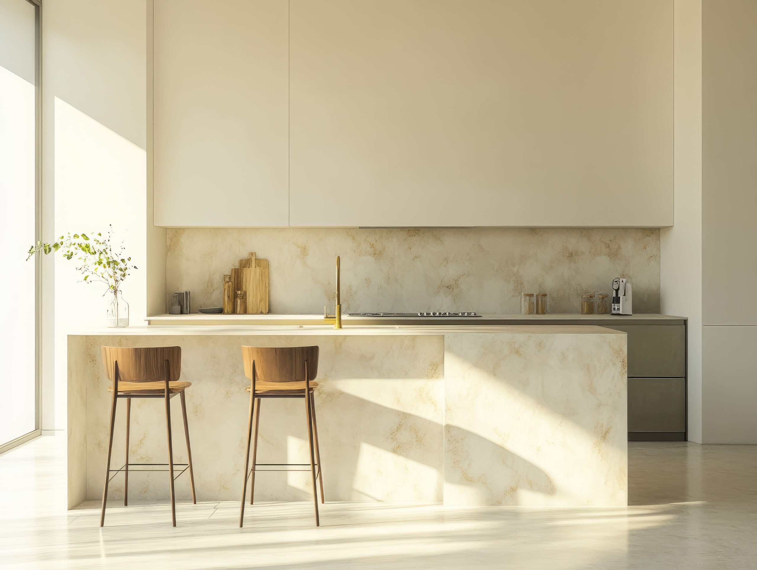
Every year, Pantone Colour Institute chooses a colour that not only defines trends in fashion and design, but also reflects the cultural spirit and aspirations of the moment. For 2026, the chosen colour is PANTONE 11-4201 Cloud Dancer — a natural, ethereal white that symbolises tranquillity, clarity and new beginnings. We already mentioned this in our Christmas post (even long before that: White, ALWAYS). ALWAYS is the colour) that, finally, we would find the “King Colour”. By the way, don’t miss these interesting posts and discover how this year, eternity envelops us and makes us its own.
“A whisper of calm that inspires quality, purity and versatility in finishes”

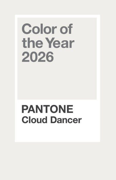
Pantone 11-4201
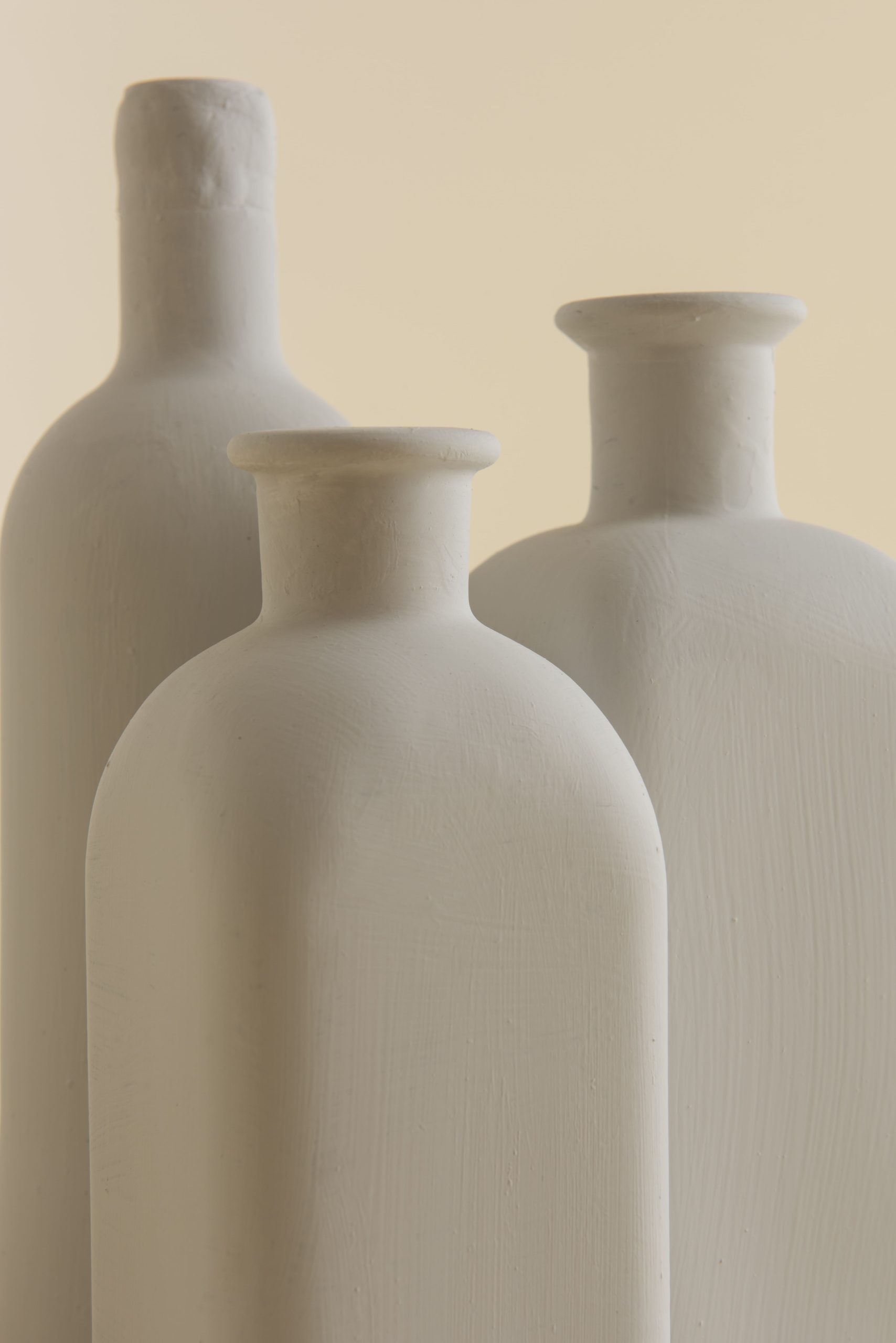
Cloud Dancer is a subtle white—not a pure, stark white—but a shade that strikes a delicate balance between warm and cool tones. According to Pantone, it represents calm and serenity in a fast-paced world, offering a visual refuge from everyday noise. A new beginning, like a blank canvas for creativity and innovation. Clarity and reflection, connecting with cultural trends of simplicity and well-being. It encompasses everything and everyone, regardless of who you are.
Cloud Dancer is universal because it speaks a language that needs no translation: that of human emotion. It does not belong to a specific culture, age or place; it belongs to anyone who has looked up at the sky in search of calm, inspiration or freedom. Its essence connects with values shared throughout the world: lightness in the face of the weight of everyday life, movement as a symbol of change, dance as a free expression of being. Clouds know no borders, and neither do those who dance with them. Cloud Dancer represents that common desire to rise, to flow, to find beauty in the ephemeral. It is an image that each person can interpret from their own experience, and therein lies its strength: it does not impose a meaning, it suggests it. That is why Cloud Danceris universal: because it cannot be explained, it is felt.

Cloud Dancer in the world of colour
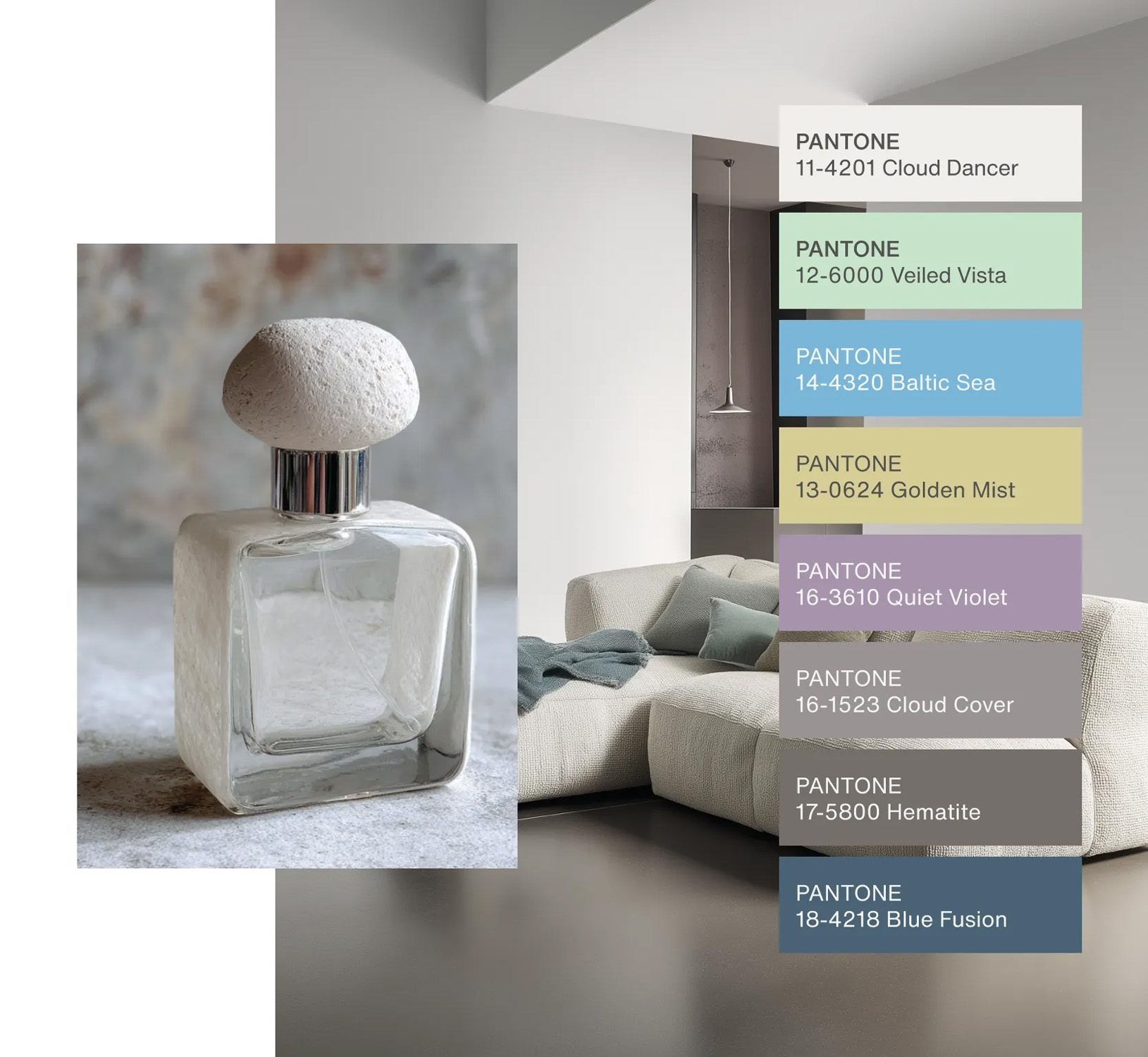
Although it may seem discreet, Cloud Dancer blends elegantly into a variety of applications: from fashion and interior design to branding, architecture and, of course, high-end colour technologies such as those offered by Industrias Químicas Iris.& nbsp;This neutral tone does not compete, but rather enhances and harmonises with other colours, making combinations of vibrant or earthy tones stand out even more.
Cloud Dancer and Industrias Químicas Iris
For manufacturers of high-quality paints and varnishes such as Industria Químicas Iris, Cloud Dancer has important implications. Colour versatility, for example. A neutral colour like this is perfect for applications where aesthetics and functionality must coexist.
Our special varnishes and finishes can utilise Cloud Dancer to create texture and depth effects that enhance surfaces without saturating them with colour. Cloud Dancer is not simply a colour; it is a design philosophy that promotes conscious simplicity, visual balance, and aesthetic versatility. For Industrias Químicas Iris, it represents a unique opportunity to innovate with products that not only protect surfaces, but also add meaning and value to the most demanding projects. Technically, at Industrias Químicas Iris, we are masters at bringing this to life for you and your sector like no one else.
Because behind a universal concept such as Cloud Dancer lies knowledge, formulation, and precision. We translate an idea into real chemical solutions, tailored to each application, each process, and each industry. We master the technology, materials, and standards required by each sector, adjusting properties, behaviour, and performance so that the result is not only aesthetic or conceptual, but also effective, stable, and reproducible.

Where others see inspiration, we see a formula.
Where others make promises, we deliver.
NCS and RAL: colour accuracy
The NCS and RAL systems continue to be fundamental benchmarks for colour standardisation in the industry. In 2026, their ranges reflect a clear orientation towards balanced, natural and technically demanding shades. The correct adaptation of these charts requires more than just visual equivalence: it demands in-depth knowledge of the behaviour of colour in each material.
With NCS and its “colour of the future”, more chromatic colours are making their way into the spotlight, combined with a refined and conscious approach. It offers four wonderful lines that allow for consistent forms of real application. These lines are:
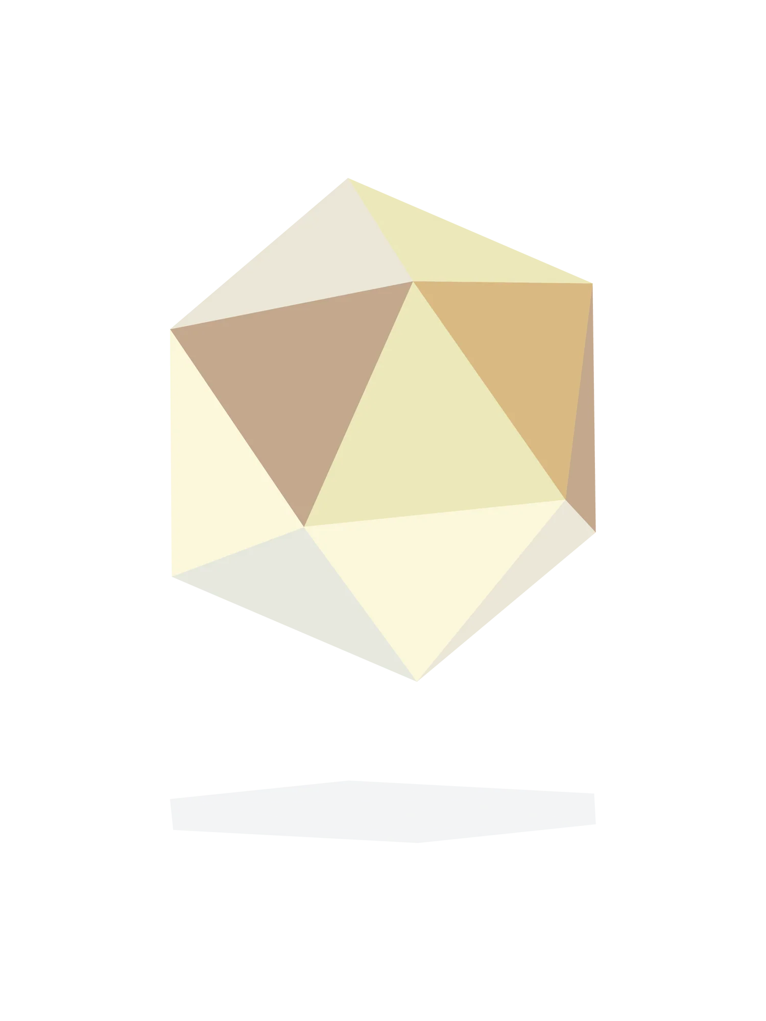
Quietude
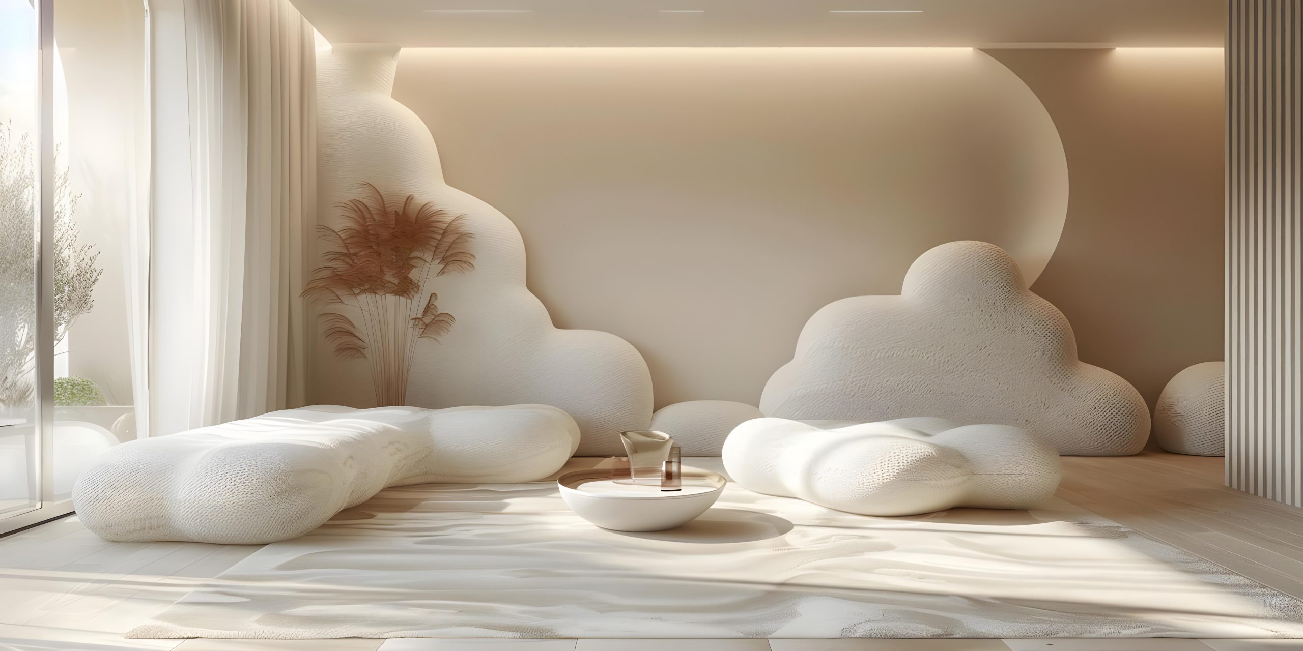
A constellation of imperfect whites and noble neutrals that depart from conventional pure white, evoking calm, timeless elegance and conscious opulence that serves as a versatile foundation for spaces and products.
Symbiosis
Colours that reflect a harmonious integration between nature, human intelligence and technology—especially artificial intelligence—represented by deep blues and rich hues that inspire collective growth and coexistence.

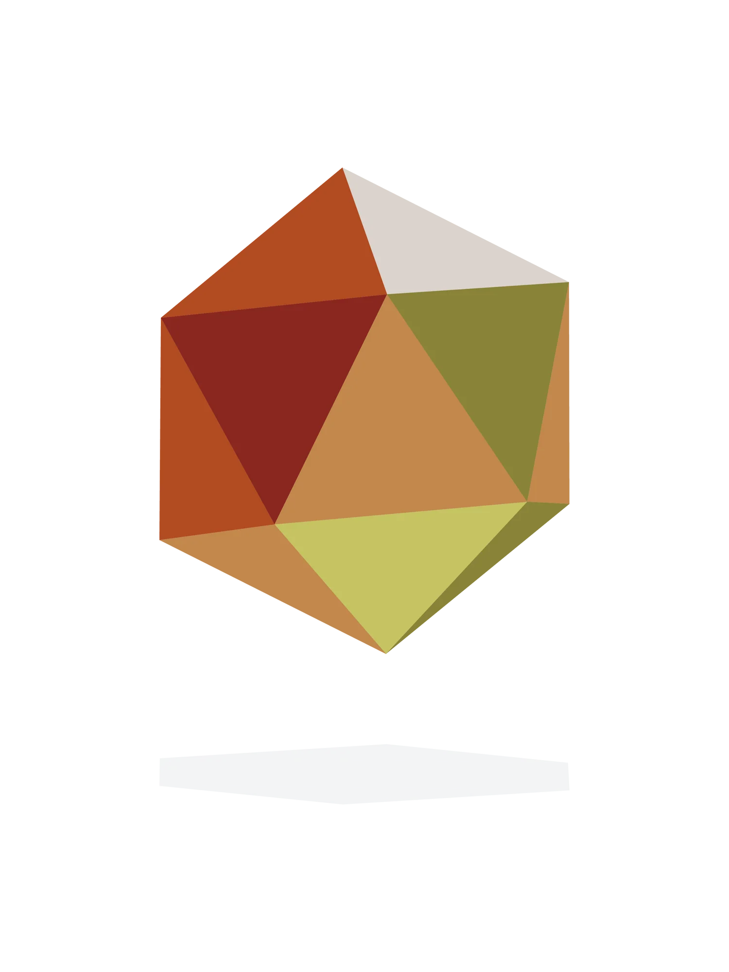
Homecoming
A palette of warm, earthy tones reminiscent of human connection, craftsmanship and belonging. This direction favours a more intimate and natural aesthetic, integrated with tangible materials and sensations.
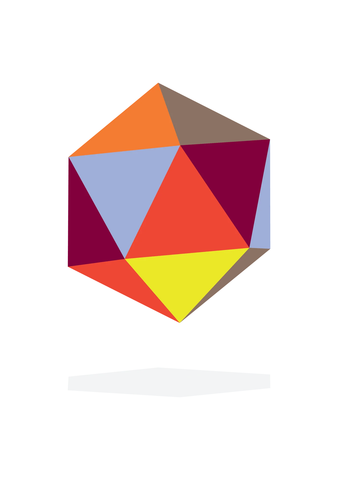
Renegade
A bold statement of creativity and intense expression, where high chromatic reds and strong tones challenge the norms. This line represents a contemporary break with convention, seeking to make colour seen and felt vibrantly.
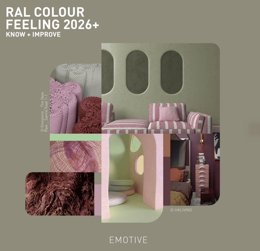
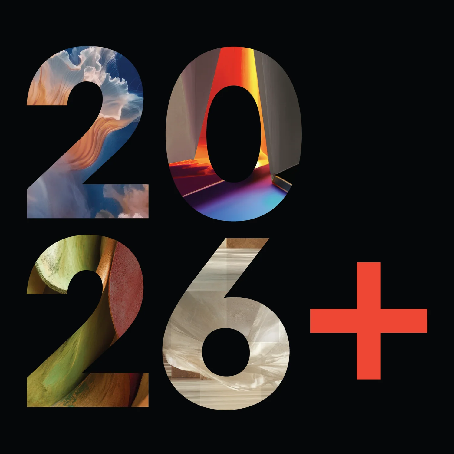
On the other hand, we eagerly await RAL’s TRENDBOX, marking its Colour Feeling 2026+ with the slogan “KNOW+IMPROVE”.
RAL translates colour into a universal technical language. It is the system that guarantees precision, repeatability and consistency in industrial, architectural and production processes. Its value lies in converting trends into a standard that can be applied, measured and controlled in any medium. For 2026, it offers a relaxing green (RAL 140 80 30), a revitalising medium green and Pearl Yellow, a pastel colour which, according to RAL Farben and Gira, provides optimism and balance.
At Industrias Químicas Iris, we work with precise colour matching between systems, ensuring fidelity, stability and repeatability in every batch, regardless of the sector or medium. Colour thus becomes a reliable tool, not a variable.

Fuente: House Beautiful UK
2026: from Benjamin Moore to industrial formulation
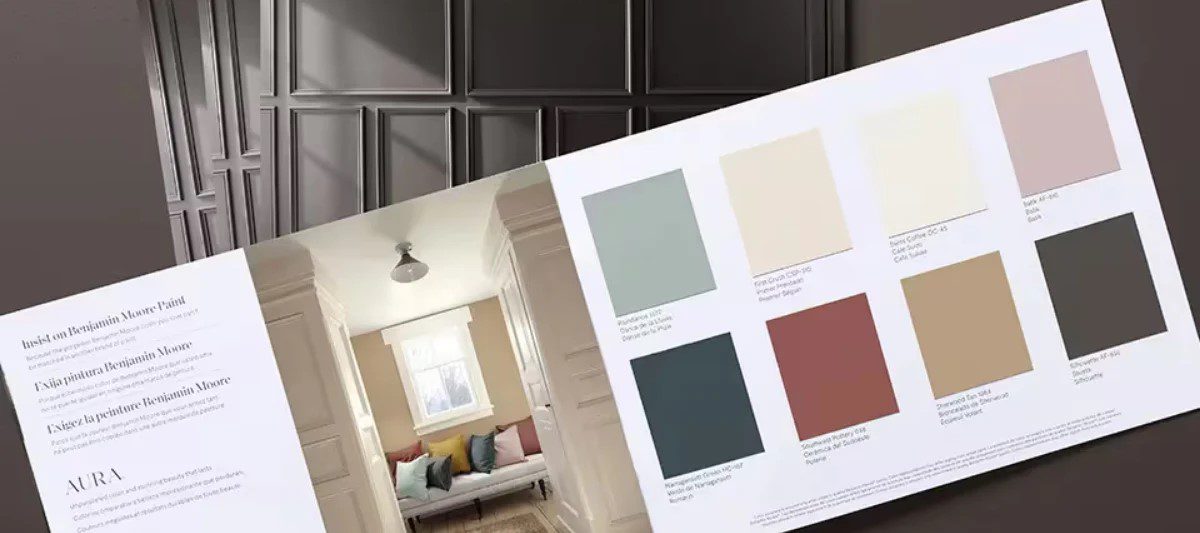
The colour trends for 2026 are moving towards a serene sophistication. The palettes proposed by Benjamin Moore focus on deep, warm and balanced tones that add character without being garish. These colours require a high level of technical precision to maintain their intensity, stability and consistency across different substrates and conditions of use.
Benjamin Moore interprets colour from the perspective of space.
Its annual proposals are not limited to a single dominant tone, but rather articulate complete palettes designed to coexist, provide balance and respond to how people perceive and inhabit their surroundings. Colour is understood as atmosphere, as depth and as a tool for creating identity. Its protagonist, Silhouette (AF-655), is a deep and versatile anchor shade, described as a fusion of rich espresso tones with subtle hints of charcoal and touches of burnt sienna. Benjamin Moore created it as an intermediate shade between black and brown, resulting in a deep and sophisticated grey-brown.
At Industrias Químicas Iris, we translate these palettes into specific chemical formulations, adjusting pigments, fillers and additives to ensure that the colour retains its essence from the laboratory to the final application. Each trend is thus converted into a real solution, designed to be produced, applied and endure.
The colour concept for 2026 is defined by a clear idea: colour with purpose. Shades are designed to complement, balance, and add functional as well as aesthetic value. It is not about standing out, but about blending in; about creating coherent, durable environments and products that are aligned with real usage needs.
At Industrias Químicas Iris, we bring this concept to life by adapting each colour trend to its technical context. We analyse variables such as resistance, durability, material compatibility, and production processes. Thus, each colour responds not only to a trend, but also to a function. So, don’t hesitate to write to us at: industrias@quimicasiris.com


Recent Comments